Too Human to be Right
Category: Print, Publication, Animation
Year: 2017
Book: The final outcome was a compilation of the work of 11 students.
Guide: Shubham Roy, Arush Dev, Milly Singh
Book Layout
Compiled largely of the declining art poster design, we have visually explored our own interpretations of these rights, through posters, manifestos, and narrative accordion formats. We explored the medium of packaging design and advertising as a conceptual commentary to imagine, what if some of the most basic elements of human life were to be commodified and sold. Our self-portraits are our design narratives, that speak on behalf of us.
Taking five fundamental declarations of human rights, vis a vis, Right to Freedom, Right to Identity, Right to Expression, Right to Privacy and Right to Education, we explore the broad ranges of spectrums of how these rights contextualize our human existence. Design, being one medium of a creative visual language for self-expression and critique, we explore and experiment upon our own comprehension, of the impact and of the presence or absence of these rights in the expanse of this world, beyond our own.
While designing the Index and Reference page, I had to keep in mind that they do not clash and at the same time, compliment the work of 10 other designers and my other work, which formed the rest of the content.
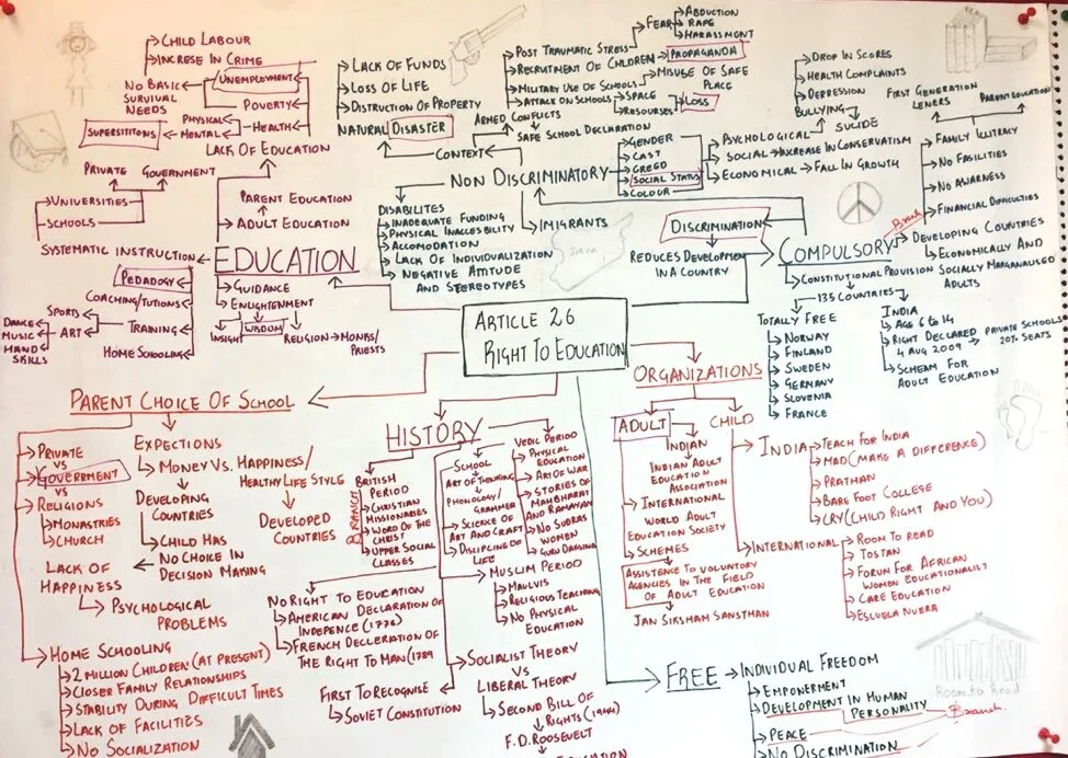
Mind Map:
The mind map helped me gain a better understanding of the topic I selected after discussion with peers. I explored the topic in different ways and I used Coloured pens and an imperial size chart paper to put my research down. After which I selected a few words to take the project forward. The words are adult, government, discrimination, social status, loss, propaganda, disaster, unemployment, pedagogy, wisdom and superstitions.
Poster Design
To create the first poster on the Right to Education (top), I used the colour green as my primary colour for the poster because, it is a colour used in primary school education to improve concentration and to keep the mind calm. I combined this colour with the concept of how education is supposed to be free, but this is not the case in India, as it can actually be bought and sold in many ways.
After working on the Right to Education for three months, I created a poster (right) with a simple message. The language you speak does not define how educated you are. I took inspiration from a famous quote by Martin Luther King but changed it to create my own message which is rooted to India. I chose to make a Typography poster as I am talking about Language.
Accordion
We explored the idea of sports as an inherent part of education, with a visual biography of the Refugee Olympic Team, which participated in the 2016 Summer Olympics. These participants were individuals hailing from war torn countries, where professional sport is a distant ambition. The accordion narrates their individual struggles to break away from their local oppression and, how they utilized an international platform of sports to bring attention to the ruthless devastation of their concept of “home”.
In the folds you will see the story of how the team was formed, Telga Loroupe, Rami Anis, Yusra Maridini, Popale Misenga , Yolando Mabika , Paulo Amotun Lokoro, Anjelina Nadia Lohalit, James Nyang Chiengjiek, Yiech Pur Beil, Rose Nathike Lokonyen and Yonas Kinde. Each of them have a fold dedicated to them, on which through typography we let the viewer experience and read their stories. We have used the olympic colours and have used the Typefaces, The Mix and Univers.
The letters on the top read Olympics 2016. The internal design of each of the letters have been inspired from the traditional South Sudan art of Scarification (generally works as a mark of identity) and prominant locations of Syria, Ethopia, South Sudan and The Democratic Republic of Congo.
Packaging Time
The aim of this project was to create Packaging for an Utopian product related to Education. The Product I chose was time. In other words I am assigning monetary value to time so that, students who are always wishing for time may it be for an important exam, a submission, or to have a longer holiday now can walk into a departmental store and buy it. A lot of students in India have been denied the right to education when they were kids because of many social reasons, even for them time is very important.
The basic theme I have taken inspriation from, for my packaging are the ancient Cultures which is something the students are taught about in their classes. The 3 different cultures are Mayan, Egyptian and Indian.
To create the logo I started with making a list of objects related to The right to Education, I finally decided that an Alarm clock is an object that every student from every walk of life can relate to. I started with detailed drawings of an Alarm clock and then started simplifying it.
After the form simplification I came up with a simple logo and took the name millisecond because when it comes to a growing student/child every millisecond counts.
This name was also related to the product I wanted to sell which was time. Time is a universal need for every individual but as we grow older, we stop wishing for more time and we start utilising our time better. When it comes to students though, they always wish and hope that they had more time on hand for studying as well as playing.


