Healthcare Dashboard
Category: UI - UX Design, Dashboard Design, Disign System
Year: 2022- 2023
Team: Pichkaari Design Studio
Objective:
The aim of this project is to create a platform that analyses clinical and operational data and represents it visualy for better understanding. In the phase one of the project we had to create dashboards for 3 departments namely ED, ETA & Cardiology.
ED Dashboard User Flow & Wireframe:
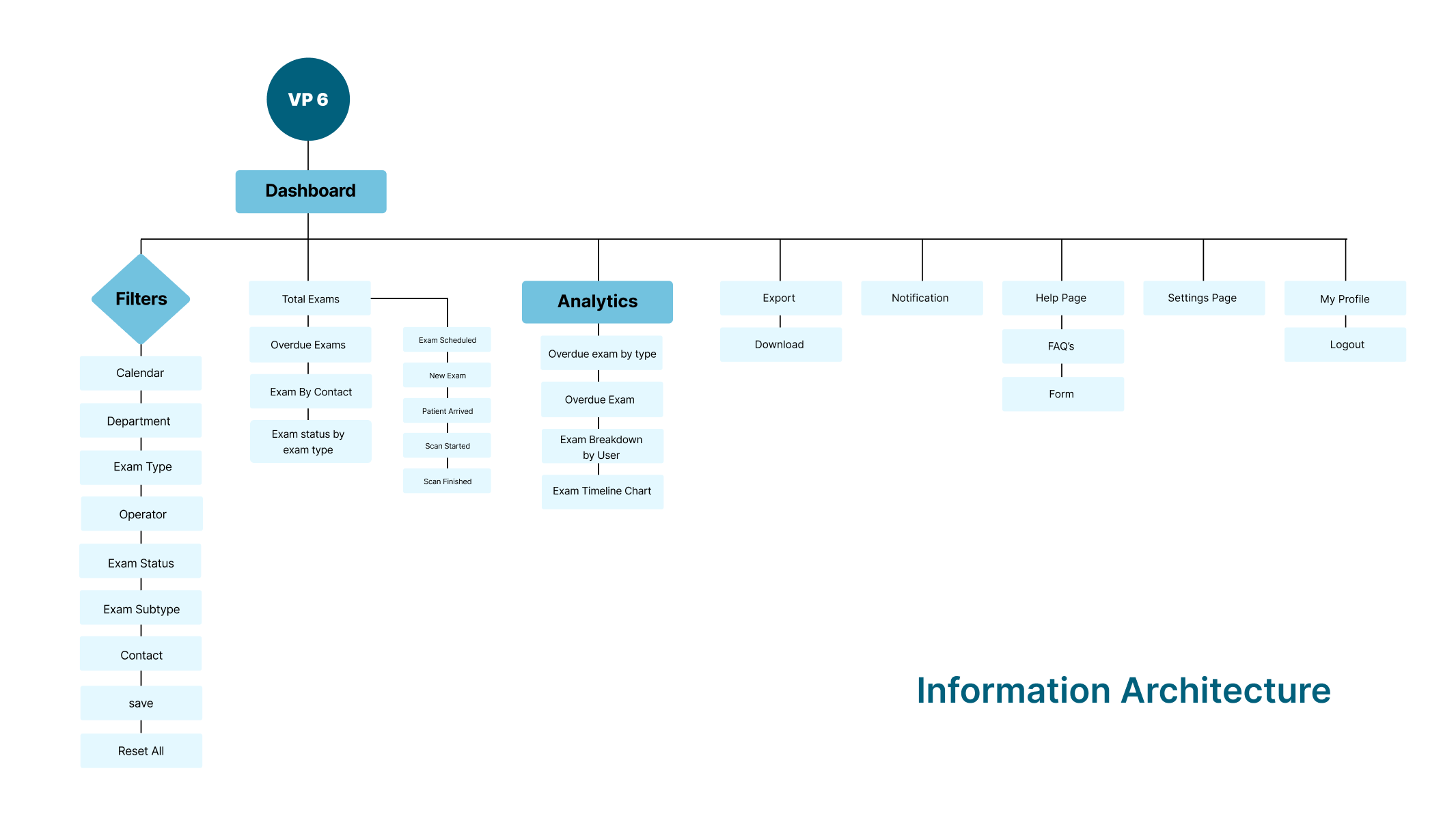
The first step of the project comprised of understanding the product and the data that is being created by the radiography machine. Once we gained an idea, we went on to creating the personas and userflows. For the ED dashboard, we identified 10 different kind of users and then on the basis of the visibility of data, we condensed the users into 3 main personas, namely Admin, HOD and Physician. An example of how we did this is, a medical student could only view his own individual dashboard where as the emergency department director could view both individual and group dashboard.
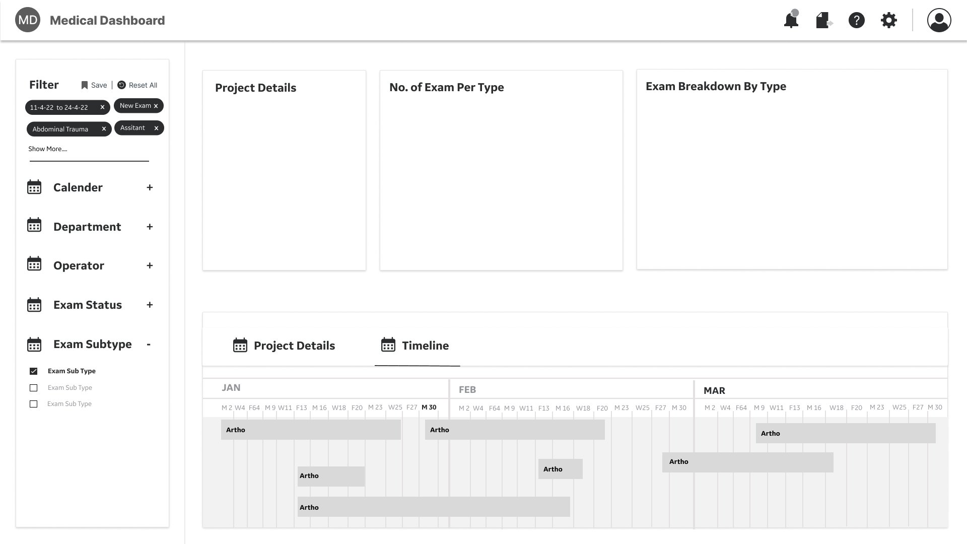
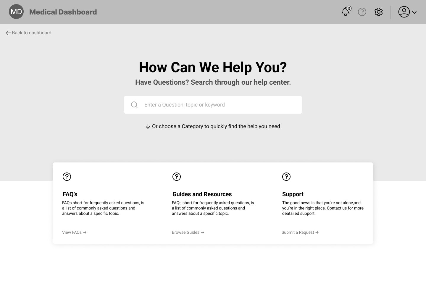
This was followed by creating the wireframes. Like seen in the wireframes below, the dashboard was divided into 2 parts the navigation and the data tiles. When the first set was sent to the users for feedback, we were told that more than the navigation, it is important for the design to enable the user to navigate by changing the type of data they are viewing on the dashbooard. Keeping the feedback in mind we decided to divide the dashboard into 3 parts, the navigation on the top of the page, a newly added filters section on the left and the data tile on the right. Here the filters selected would dictate the tyoe of data visible on the tiles.

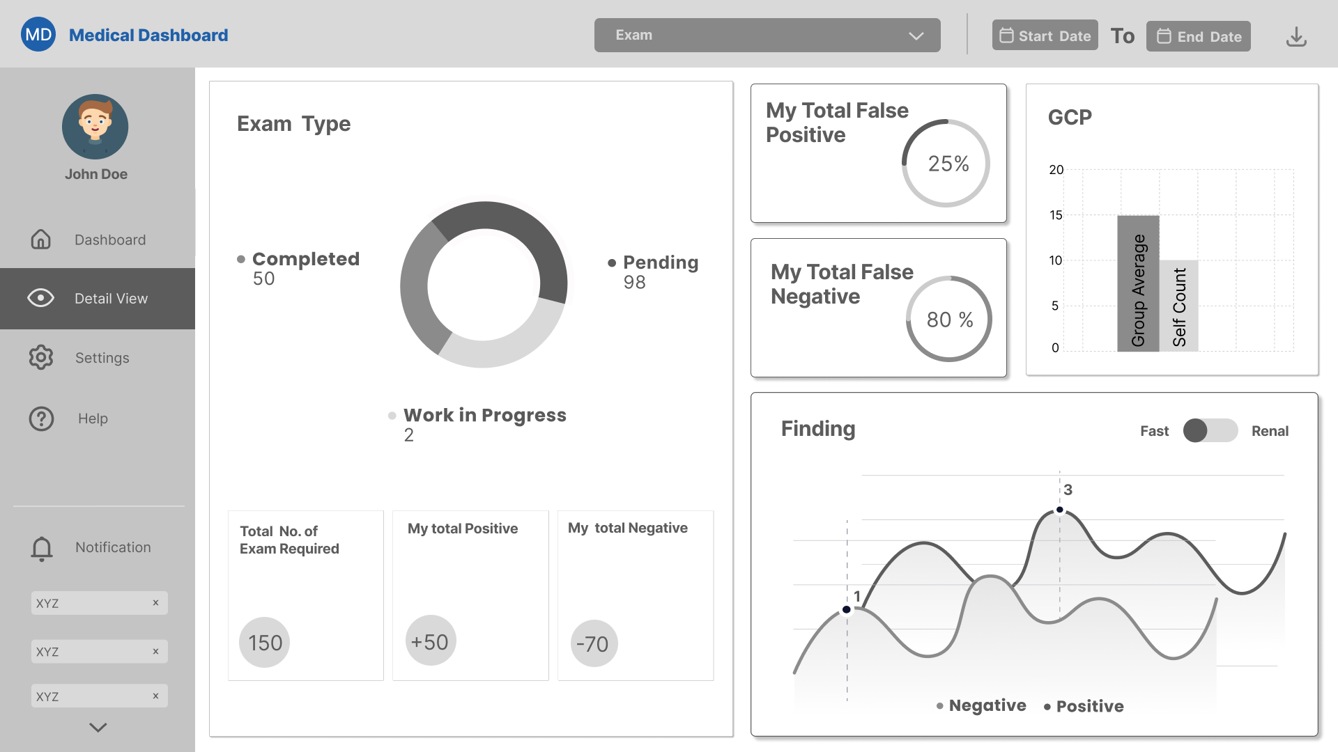
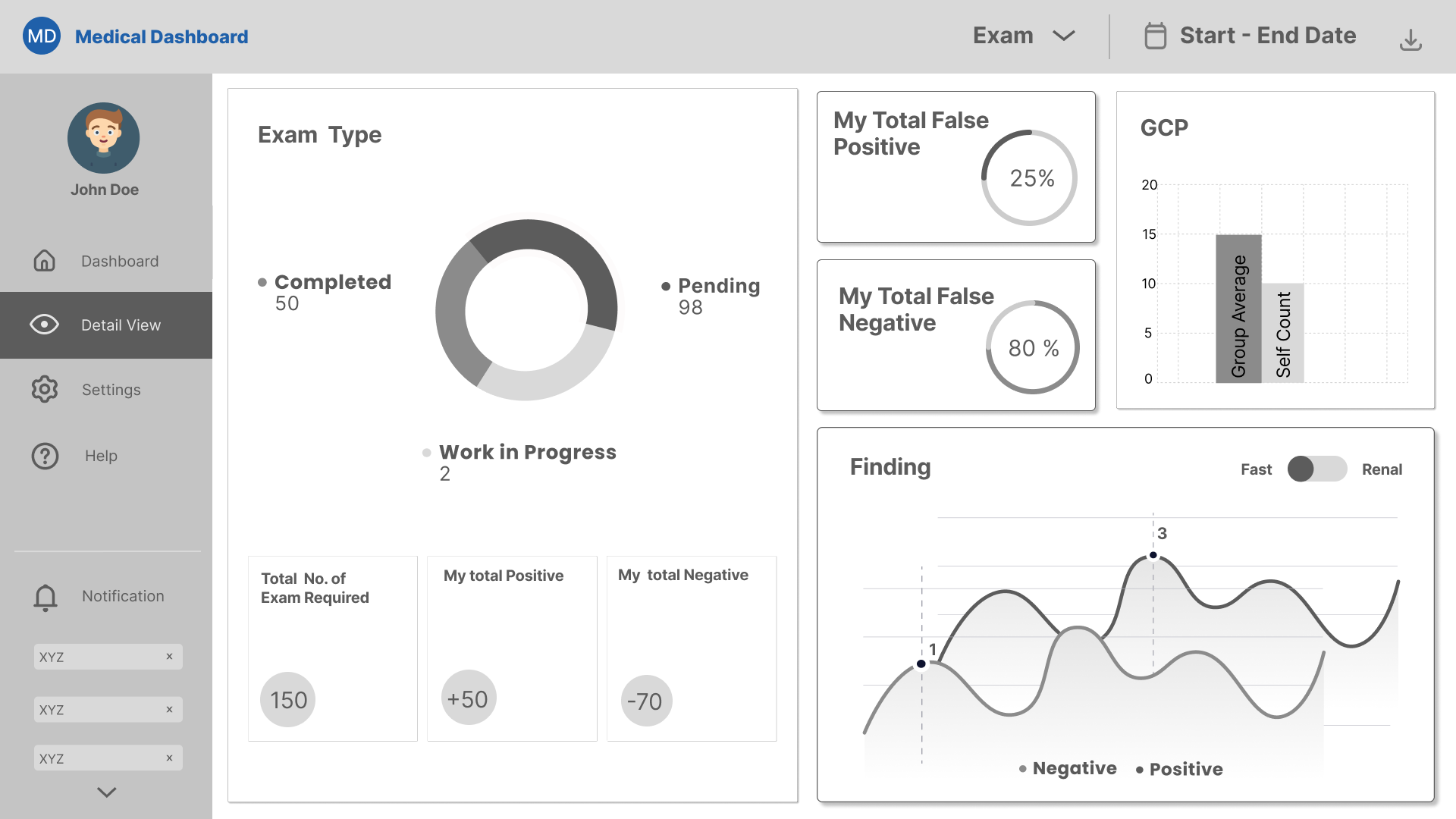

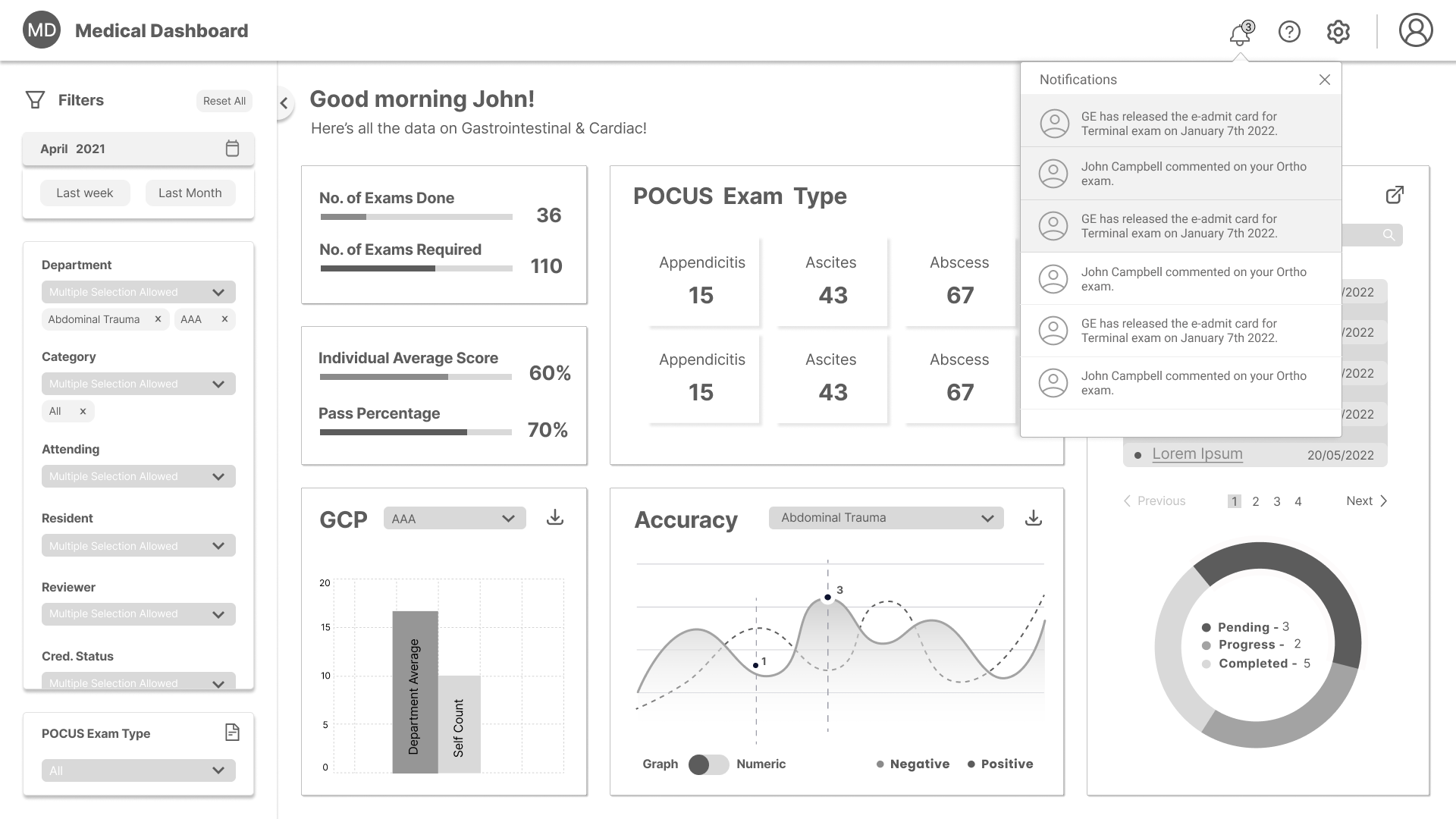

Design System:
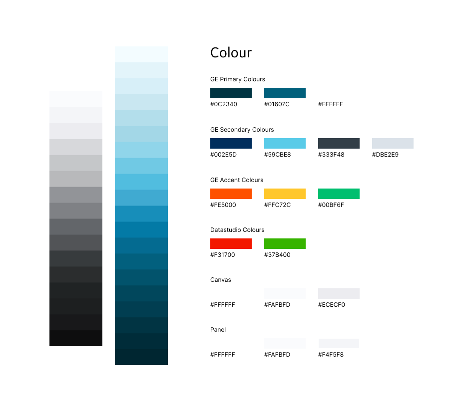
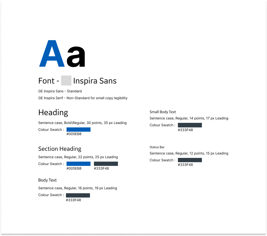
Once the wireframes were completed we went on to creating the design system for the visual design. This was created and built keeping the brand guidelines in mind. The components that we created were grids, colours, fonts, buttons, icons, dropdowns, calenders, pagination, hyperlinks, header, filters & graphs. The desgin system developed and grew through the entire process of creating 3 different but similar dashboard designs.





ETA Dashboard
This dashboard was designed keeping the Exam Type Analytics department in mind. Two users were identified the HOD and the General Physician. For this dashboard there were no view restrictions because of which both the users had the same user flow.
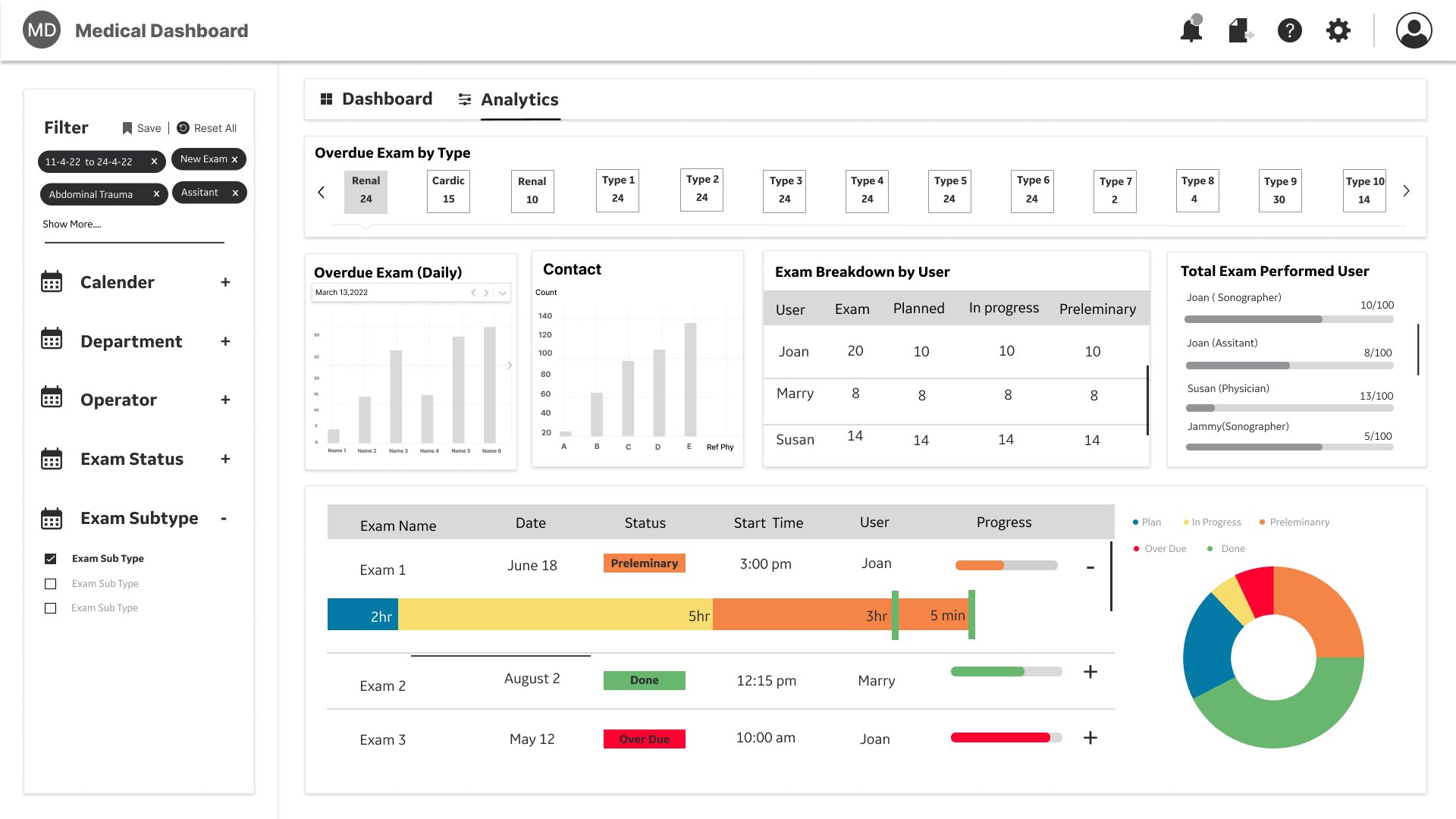
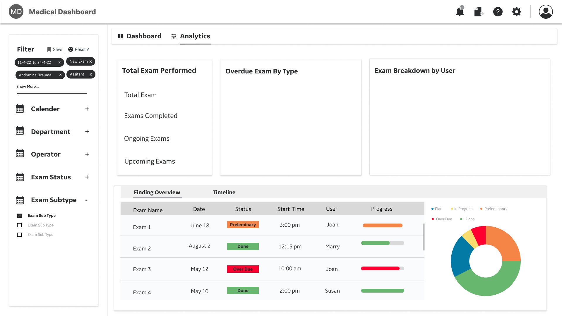
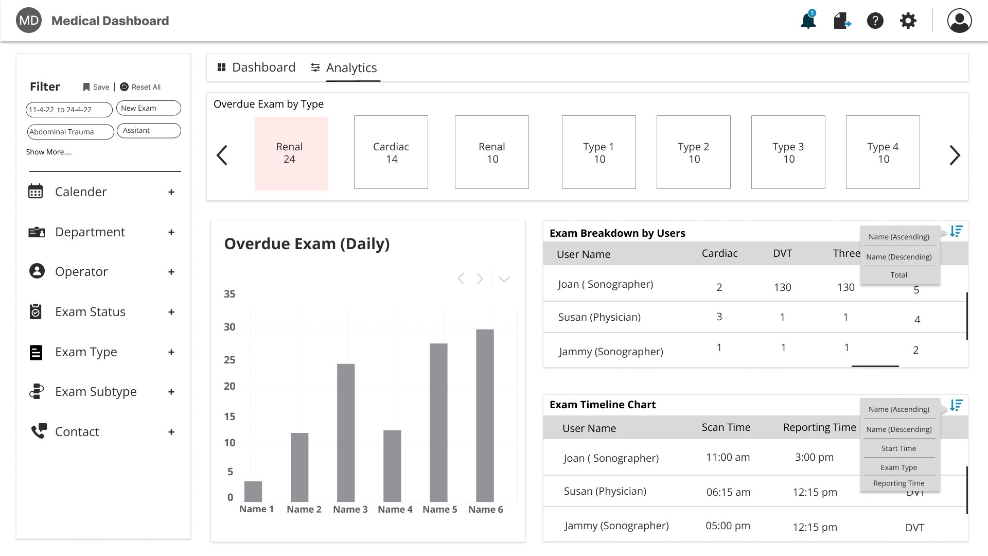
According to the feedback we recieved and updated 2 sections: we changed the filter and introduced 2 types of views. The major change in the filter was that initially the selected filters were getting pre populated under each of the categories making the filter have a indefinite scroll. In the new design we converted the filter into an accordian format and created a seprate section for the selected filters. We also added an expanded view of the selected filters, so that only 3-4 of the latest selected filters would be visable at all time and the remaining were hidden under a show more hyper link. In respect to the views, in this dashboard there is a Dashboad view which, showed cumilative data in the form of charts and the other view is the Analytics view, which showed comparative and detailed data.
