Datahash
Category: UI - UX Design, Website Design, Huristic Evaluation
Year: 2022
Team: Pichkaari Design Studio
Objective:
Datahash aims to enable advertisers to take data driven decisions and also connect them to the channel partners. The aim of the project was to conduct a huristic evaluation of the current website and create an updated user experience and user interface design.
Huristic Evaluation & Information Architercture :
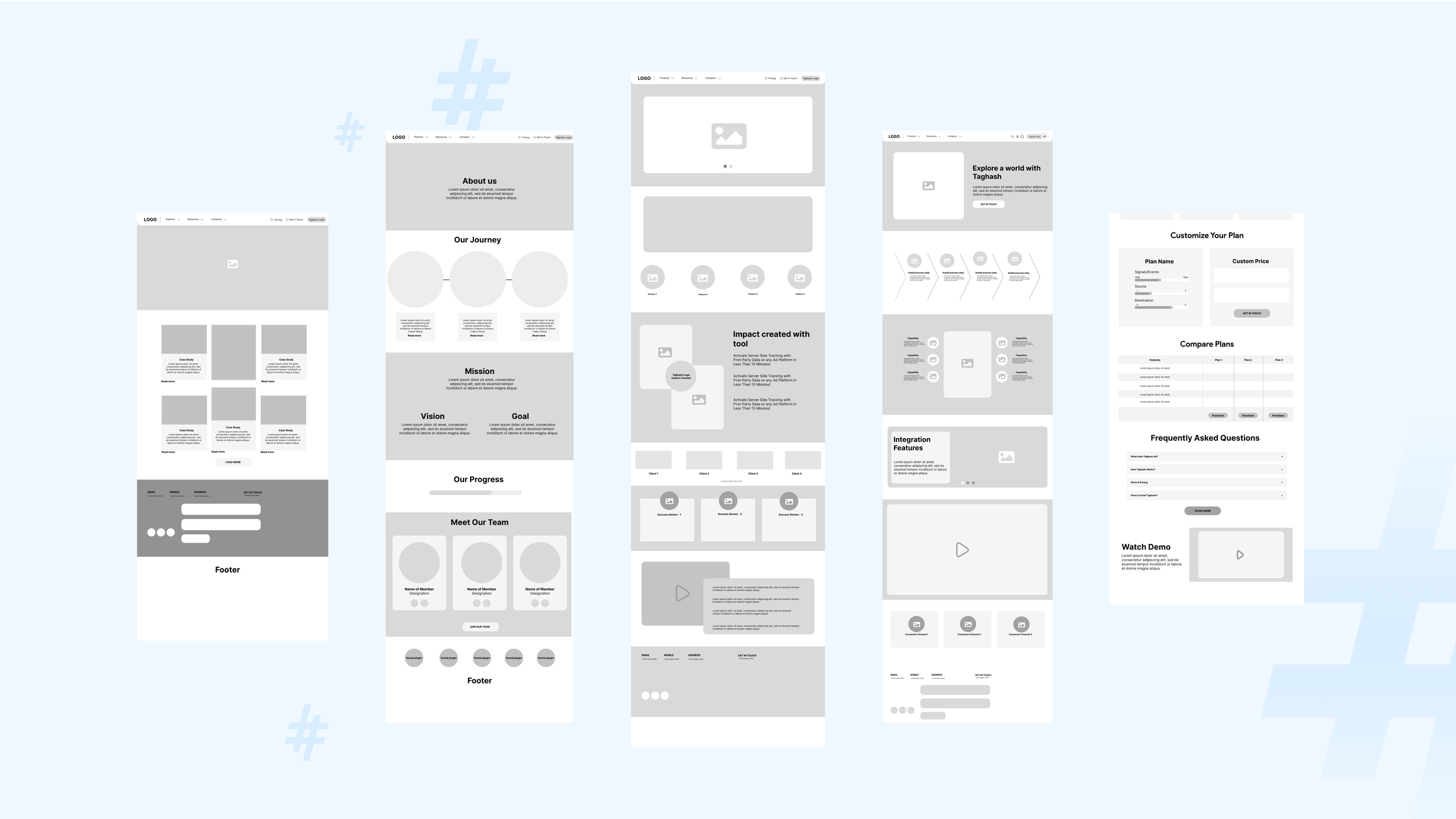
Some of the issues that we identified while conducting the huristic evaluation are: Visibility of System Status, Match between system and the real world, User Control and Freedom, Consistency and Standards, Recognition rather than recall & Help and documentation. The following are some of the aspects that were then recognised as action items that needed to be re-visited when re-designing the interface:
Navigation
Consistency in Visual Language
Footer Design
Information Accessibility and Hierarchy
Microinteractions and Feedback from the System
Increase Recognition
Visual Design
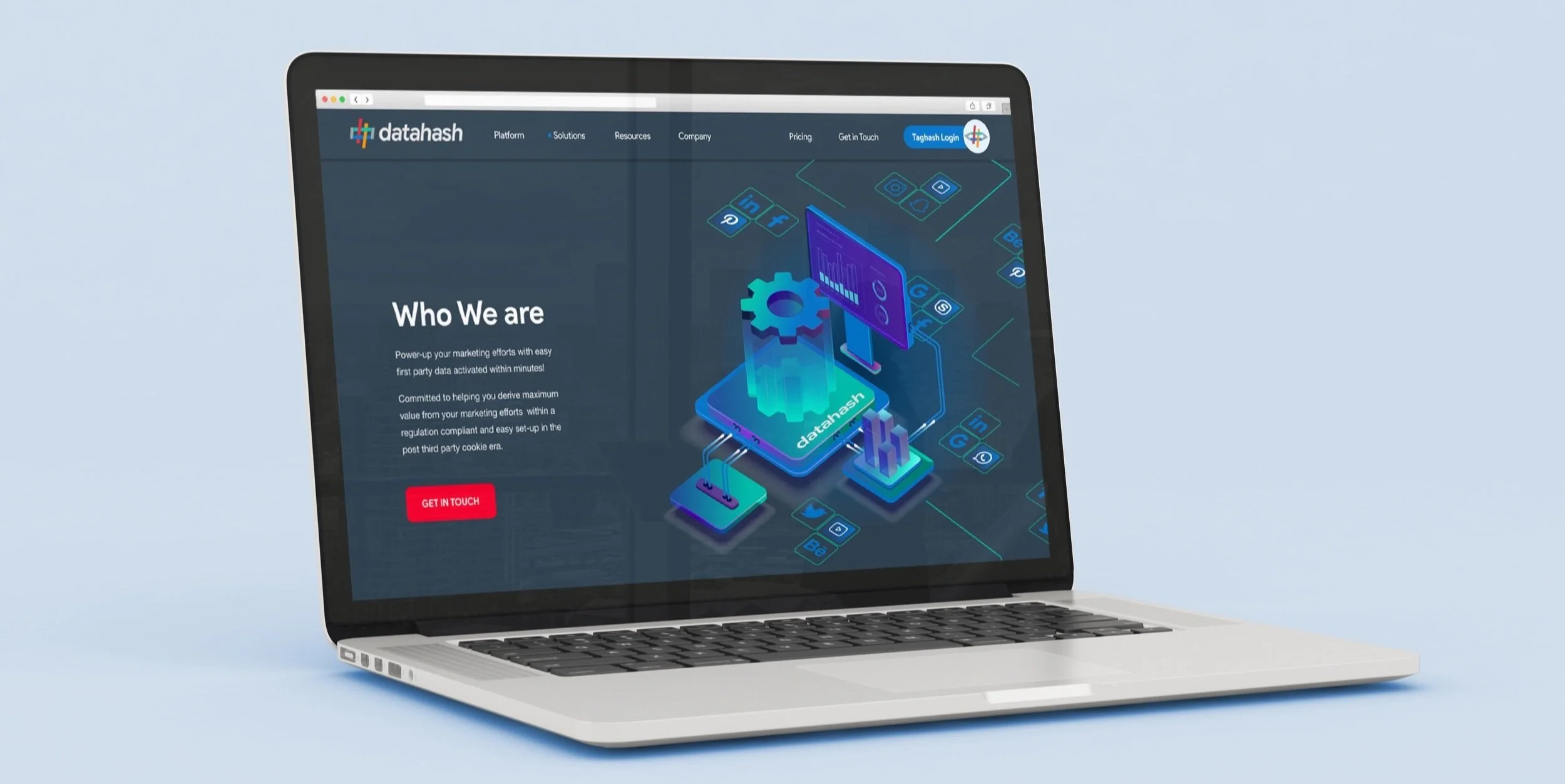
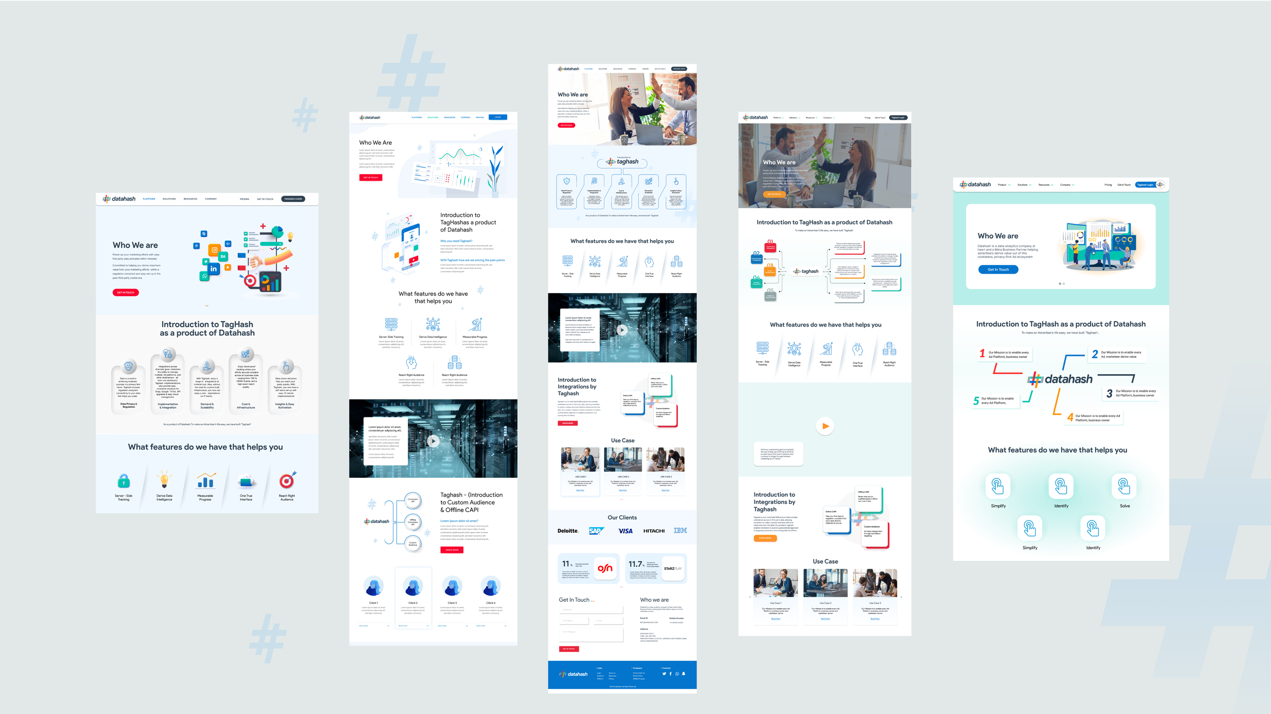
One of our main challanges came while doing the visual design. This mainly happened due to incoherence between the stake holders and users. To finally shortlist on a particular visual style we conducted a survey. The style that was finally selected was a 3d/ isometric graphic style as they felt that it did justice to the unique approach the company takes.


